Philosophers Fuel
A nootropic brand, focused on mental wellness.

Overview
Philosopher's Fuel is a wellness startup building nootropic supplements for people who are tired of being sold to. I came in as a designer with one brief: build everything from zero. The founders had a product worth trusting. My job was to make the world believe that before a single bottle shipped.
|
|
|
|
WHY THIS PROJECT?
The supplement industry is one of the most visually dishonest spaces in consumer products. Walk down any pharmacy aisle and you'll see the same thing neon colors, aggressive claims, ingredient lists designed to overwhelm rather than inform. I'd watched people I know dismiss genuinely useful products because the packaging made them feel like a scam.
When the founders of Philosopher's Fuel came to me, they weren't asking for pretty packaging. They were asking for credibility. They had a product built around a real problem brain fog, cognitive fatigue, the kind of mental heaviness that students and professionals push through every day and they needed design to do what the product couldn't do before someone bought it: earn trust.
That's a design problem I wanted to solve.
PROBLEM
The supplement industry has a trust problem. Loud labels, exaggerated claims, ingredients nobody can pronounce. Most brands look like they're hiding something behind the noise.
Philosopher's Fuel was different in intent genuinely trying to help people with brain fog and cognitive performance. The design needed to prove that before a single bottle shipped.

Competitor research grid
RESEARCH
I tested three directions with five of my interview participants before committing. Direction one was clinical and light, white, minimal, scientific. Direction two was earthy and warm, greens, naturals, botanical. Direction three was dark, premium, and philosophical. Direction three won unanimously. The specific feedback:
"This one looks like it's not trying to convince me of anything." That was the confirmation I needed.
Three things came up in almost every conversation:
Brain fog was universal. Students before exams, developers in late-night sprints the experience was the same regardless of who I talked to.
They wanted to feel natural, not altered. Nobody wanted intensity. They wanted to feel like the clearest version of themselves.
Trust was the real barrier. The supplement market had burned people. The word that kept coming up was natural, not as a claim, as a feeling.
"I don't trust anything that looks like it's trying too hard to sell me something."
That single sentence became the design brief.

Mood board
BRAND DIRECTION
The Bottle
THE LOGO
The fire symbol represents the spark of mental clarity. But the decision I'm most proud of is structural, the frame around the symbol is modular. Swap the symbol, keep the frame, and a new product line has its own identity without breaking brand recognition.
The founders immediately saw the business value in that call. One logo system that scales to every future product without a rebrand.

#1
The Brand System
Every element has a reason behind it.
Color - dark palette signals premium, creates contrast that makes the product pop in both digital and print. Tested against all three mood board directions, dark won on every trust metric from participants.
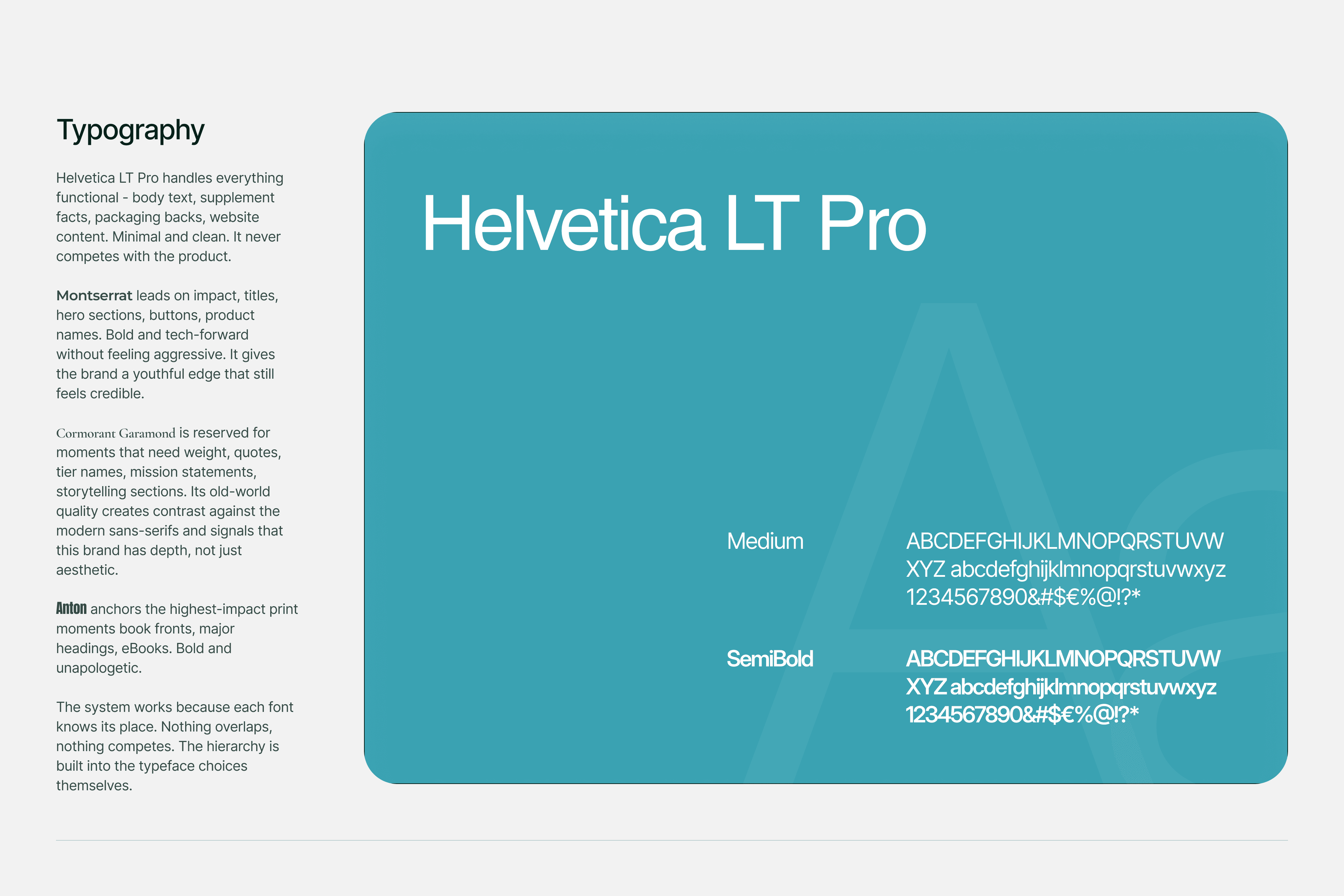
Typography - nothing decorative, nothing that competes with the product itself. The type should whisper, not shout.
Gold accents - used sparingly, only where they add tactile perception of quality. The restraint is intentional. Gold everywhere means nothing. Gold in the right place means premium.
Every decision was tested against one question: does this make the product feel more trustworthy or less? Anything that didn't pass got cut
Brand guidelines

Brand guidelines
#2
This is where the work got real. I could have used stock mockup templates. I didn't.
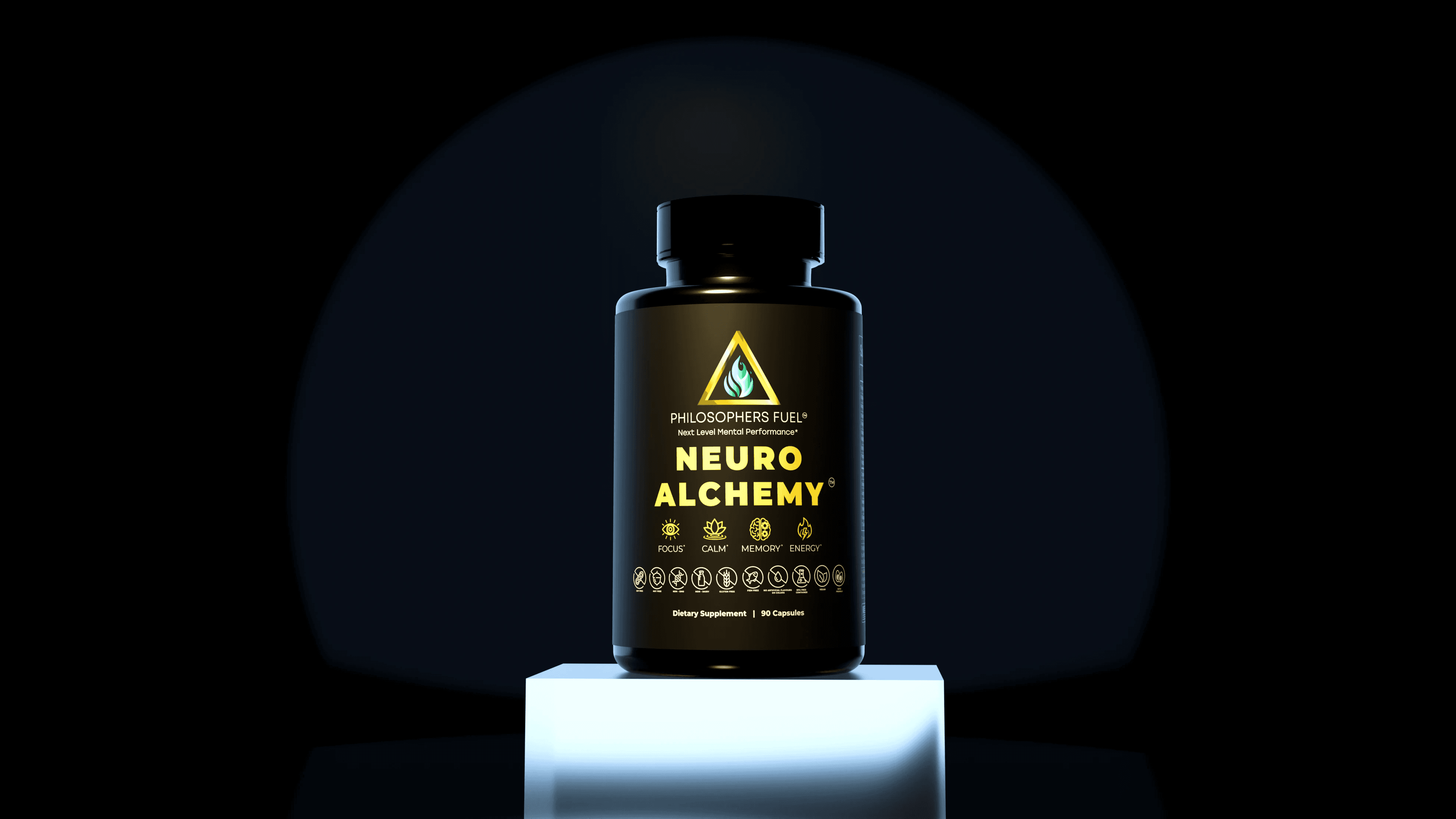
I learned Blender to model the bottle from scratch, because a generic mockup on a premium brand immediately breaks the illusion. The physical product needed to feel real before it existed.
Before
After
The label went through several passes. I kept stripping things back. If it didn't need to be there, it wasn't. The raised logo emboss and gold foil print were decisions made specifically to give the digital renders a tactile quality, when someone sees it on screen they should almost feel the texture.
Before
After
#4
Website
The first version of the site had been built mostly with AI tools. It looked generic and didn't match the brand standard we had built for the physical product. I redesigned it in Framer.
The 3D problem. First instinct was to embed the actual 3D model into the hero. It looked incredible. In practice it made the site slow and buggy on most devices, and a buggy hero on a brand trying to build trust is worse than no 3D at all. The final site loaded in under 2 seconds. Switching to high-fidelity 2D renders wasn't a compromise. It was the right call.
The layout problem. The original hero was horizontal. On most screen sizes the bottle was cut off or pushed below the fold. I redesigned it into a vertical layout — the bottle became the undeniable focal point the moment the page loads.
The reference I kept coming back to was Apple. Not copying it, borrowing the principle. Let the product be the hero. Remove everything that competes with it.
Before
After
#5
What I Learned
Performance is part of the design. The 3D model decision taught me that beautiful and functional aren't always the same thing. The right call wasn't the most impressive-looking one, it was the one that served the user best.
Research changes everything. Going in I assumed people wanted supplements that looked scientific. The interviews told me the opposite, they wanted supplements that looked honest. Without those 20 conversations I would have designed the wrong brand entirely.
Modularity is a gift to future you. Building the logo to be interchangeable wasn't extra work, it was the kind of decision that makes a brand last.
Details are trust signals. The cohesive brand system I created was directly integrated into the investor pitch deck, contributing to a $100K seed funding round. That wasn't a side effect of the design, it was part of the outcome. Every gold foil detail, every typographic decision, every stripped-back label, it all added up to something investors and users felt before they could articulate why.
#6
Conclusion
A brand built from zero that went from a founder's idea to a funded, launch-ready product. The design system and renders fed directly into the investor deck. The e-commerce conversion rate came in 20% above industry benchmarks. The logo system scales to new product lines without a rebrand.
But the number that matters most to me isn't the funding or the conversion rate. It's the participant who said "this one looks like it's not trying to convince me of anything." That's the brief I was given. That's the brief I delivered.

Hero


